Customer layout
What are the customer layout options? Customer layout overview
How do I add actions to the customer information? Action icons
How do I display data from the database in the customer information? Tokens
How do I customize my customer layout? Setting up customer layout options
Customer layout overview
ITCC allows administrators to customize how customer information is displayed on the ticket processing page. Customer layouts help agents quickly access important customer details such as contact information, job title, department, and available communication actions.
The most commonly used customer layout looks as follows:
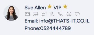
A typical customer layout includes:
- customer's photo or icon
- customer's first and last name
- VIP flag, if applicable
- customer's email
- customer's phone number
You can choose to omit any of these items. You can also include additional items.
For example, your customer layout can include your customer's title or department.
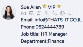
Typically, customer information appears in the top right corner of the ticket processing page.

You can also split up customer information, so that some of it appears at the top center of the ticket processing page and the rest in the top right corner.

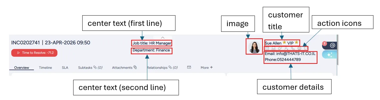
Customer layout components
A customer layout consists of the following components:
- image
- customer title
- customer details
- center text (first line)
- center text (second line)
The locations of each the components on the screen is illustrated in the following diagram:
Action icons
You can include actions available for this customer into your customer layout.
The actions are displayed as icons under the customer title.

By default, the following action icons are included:
- email customer
- WhatsApp customer
- change customer or update customer contact information
- call customer
- view customer information
- message customer
If needed, you can remove any of these action icons, and you can include additional action items.
You can specify which action icons to include when you set up customer layout options.
Tokens
You can use tokens to retrieve and display customer information.
A token corresponds to a field or attribute value associated with a specific customer.
For example, the token #JOB_TITLE# corresponds to the customer's job title.
You can view all available tokens in the Available #TOKENS# dropdown list when you set up customer layout options.
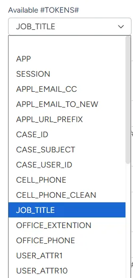
When you select a token from the Available #TOKENS# dropdown list, the token appears in the Copy Token read only field.
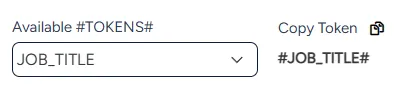
To use the token in the customer layout, copy it by selecting the copy icon and paste it into the field where you want it to appear.
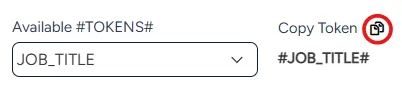
For example, in the following figure, the customer's job title is set to be displayed in the first line of the center text (Center text refers to the information displayed in the top-center area of the ticket page).

On the ticket processing page, the customer's actual job title from the database is substituted for #JOB_TITLE#.

Setting up customer layout options
You can set up customer layout options at any time.
During setup, the preview of your customer layout appears at the top of the page.
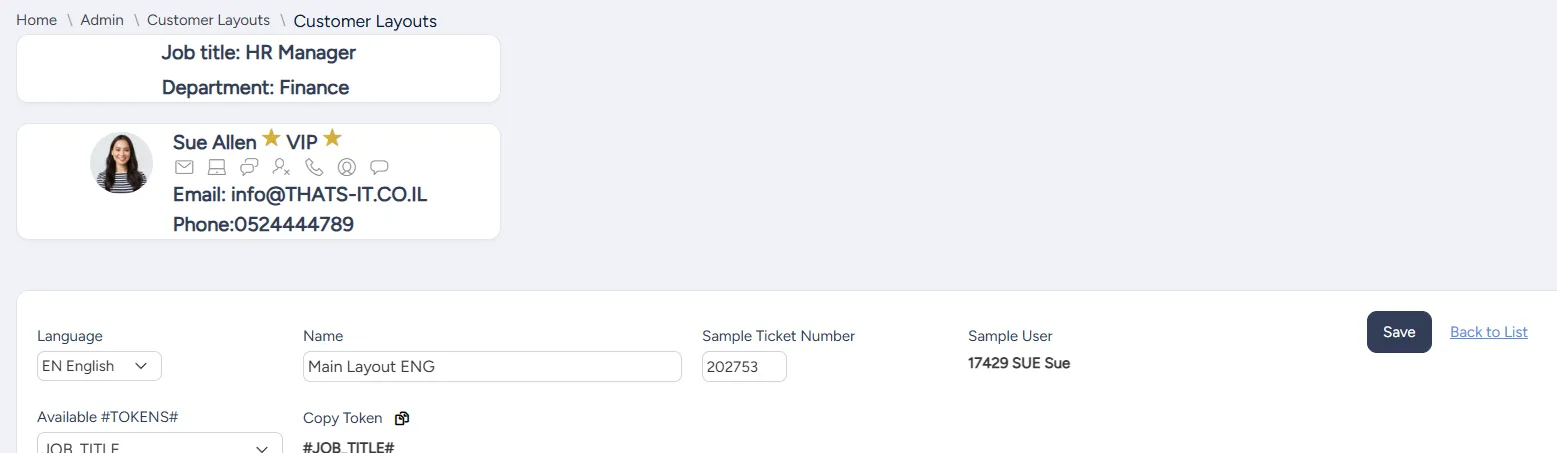
Whenever you update your layout and select Save, the preview is updated.
You can enter a sample ticket number to be used for the preview. The sample user for this preview is displayed in the read only Sample User field.
To set up customer layout options:
On the left side menu, select Administration.
In the search bar under Search for Admin Configuration Options, enter Customer Layout Options and select the Customer Layout Options option that appears.
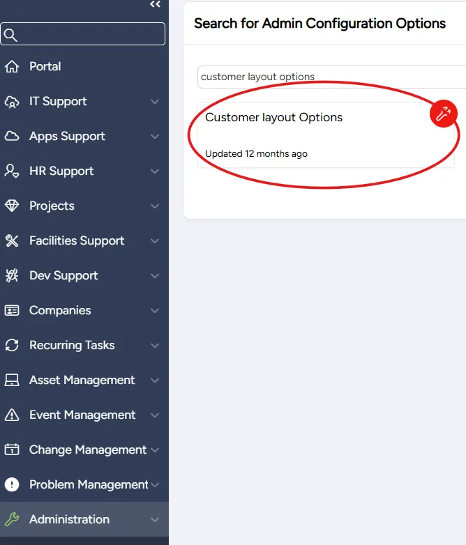
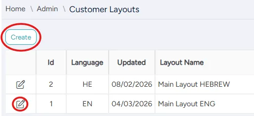
On the Customer Layouts page that opens:
- to add a new layout, select Create
- to edit an existing layout, select the Edit icon in its corresponding row
On the Customer Layouts page that opens, enter or edit the following settings:
Field | Description |
|---|---|
Language | Select this layout's language |
Name | Enter this layout's name |
Sample Ticket Number | Enter the number of the ticket to be used in the preview |
Sample User | (Read only) User used in the preview |
Available #TOKENS# | Tokens available for this customer layout |
Copy Token | Currently selected token available to be copied |
Customer Title | Enter customer title in HTML format, using tokens |
Customer Title CSS | (Optional) Use CSS to customize the appearance of the title line |
Customer Details | Enter customer details in HTML format, using tokens |
Customer Details CSS | (Optional) Use CSS to customize the appearance of the customer details |
Center Text (first line) | Enter first line of center text in HTML format, using tokens |
Center CSS (first line) | (Optional) Use CSS to customize the appearance of the center first line |
Center Text (second line) | Enter second line of center text in HTML format, using tokens |
Center CSS (second line) | (Optional) Use CSS to customize the appearance of the center second line |
Fill in or edit the action icon table.
- To add an action icon, select Add Icon Row.

- For each icon, enter or edit the following settings:
Field | Description |
|---|---|
Active | Select if this icon is active:
|
Location | Select this icon's location:
|
Sequence | Enter this icon's sequential number |
Icon Class | Enter the icon's class |
Help Title | Enter help text to appear when hovering over the icon |
URL | Enter the URL of the action corresponding to the icon (can include token, app, or session) |
- To delete an icon, select Delete Icon Row.

Select Save.